In the last two weeks I played around with the new paints. I want to show some samples.
Be warned, I'm no model painter, I paint armies, so I do not try to get up to Golden Demon standard, but to get the best result in the shortest time.
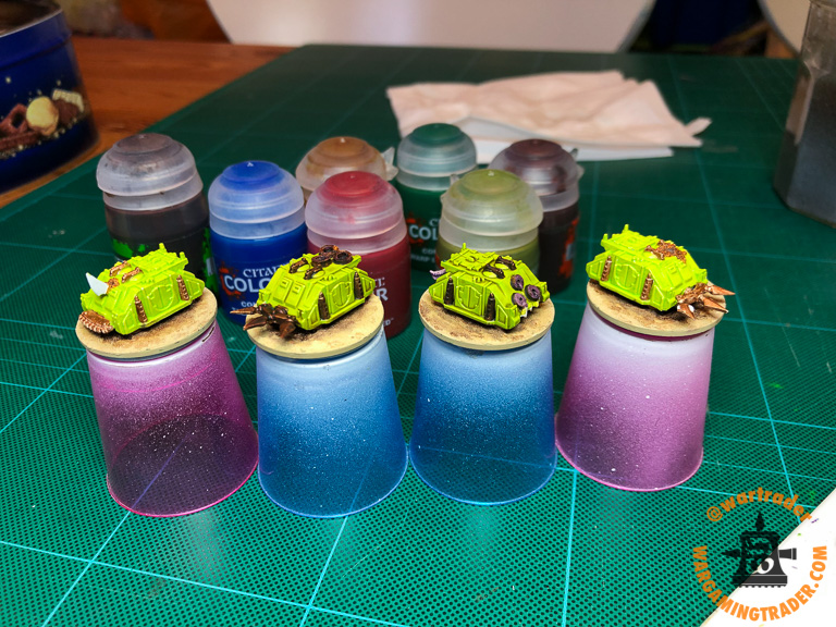
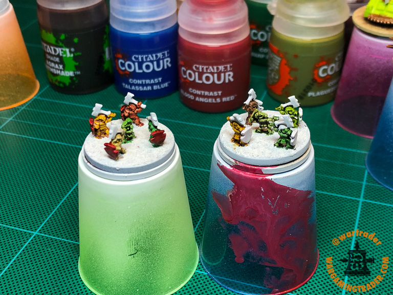
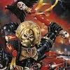
This is the tableau:

All colours contrast paints except silver and copper.
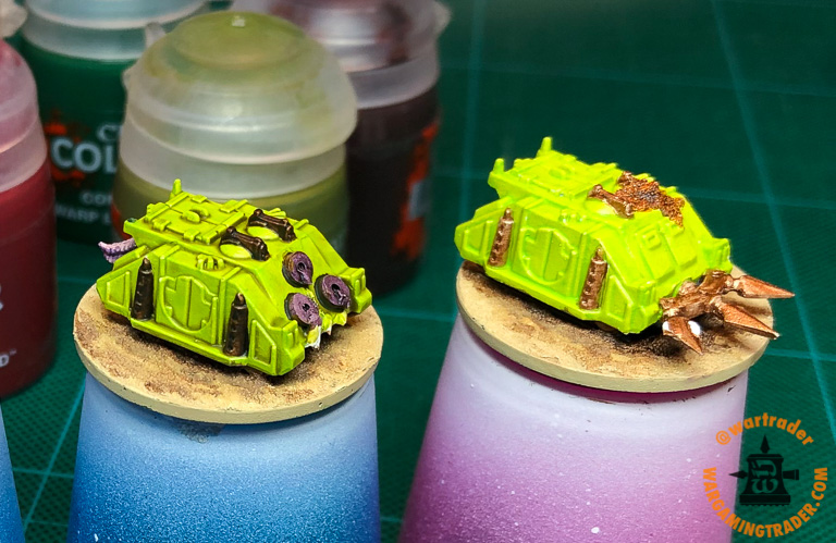
Epic Landraiders. One with yellow slapped on and one with 50% diluted Yellow. On the dark one I tried to get rid of blotching while the colour was still a bit wet, this might have worsened the splotchiness.


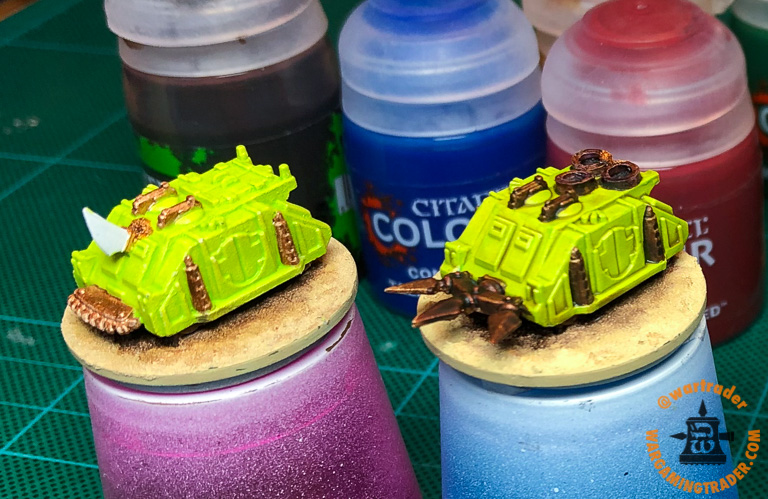
This one shows the strength of contrast paints.
Single coat of paint over that's it.

Splotchiness depends on a lot of things and some colours are more forgiving than others.
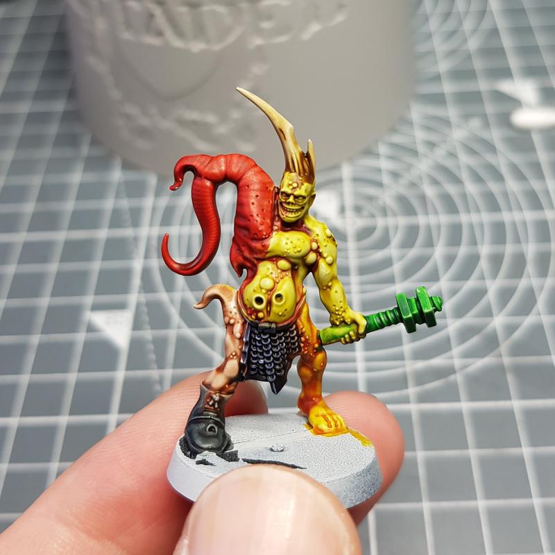
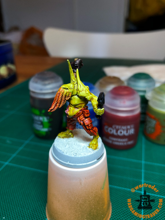
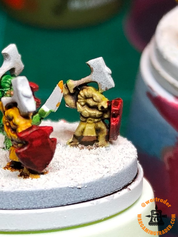
Especially on a silver base colour the splotchiness is less. The splotchiness on blue over silver (armour) and the brown over silver (it's not gold) is much lower than on the Ogrette's bustier.
When you do some pixel peeping you can make out some spots on the flamers tank, you do not notice them in real life.

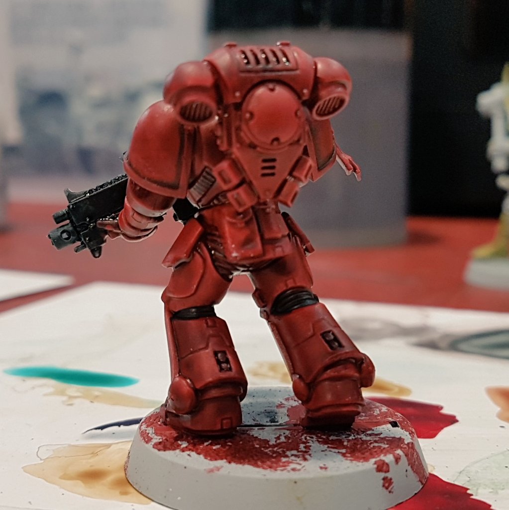
Note the blue plasma on the red lady's gun, which is a very nice effect for just applying a single colour. The red plasma looks in real life much brighter than on the photograph.
Also shoulder pads do rarely show show splotchiness, despite being flat surfaces.

I'm sure that the results will only get better with practice.
For somebody like me the colours are fabulous, your mileage might vary.


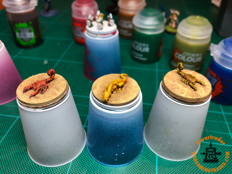
 It's just sprayed silver with just one coat of undiluted contrast paint over each of the areas. I might use this scheme for my Epic Ultramarines.